- Hospitality
- Web build
- Brand
The CharlesGate Residence
A short-let property that had to sell itself before arrival
- Role
- Product Designer and Developer
- Timeline
- 2024
- Team
- Solo, with the property owner
- Platforms
- Web, mobile-first
- Status
- Live at thecharlesgateresidence.com
- Outcome
- Direct enquiries now come through the site instead of third-party listings. Directional
Directional: observed in practice, not instrumented
The problem
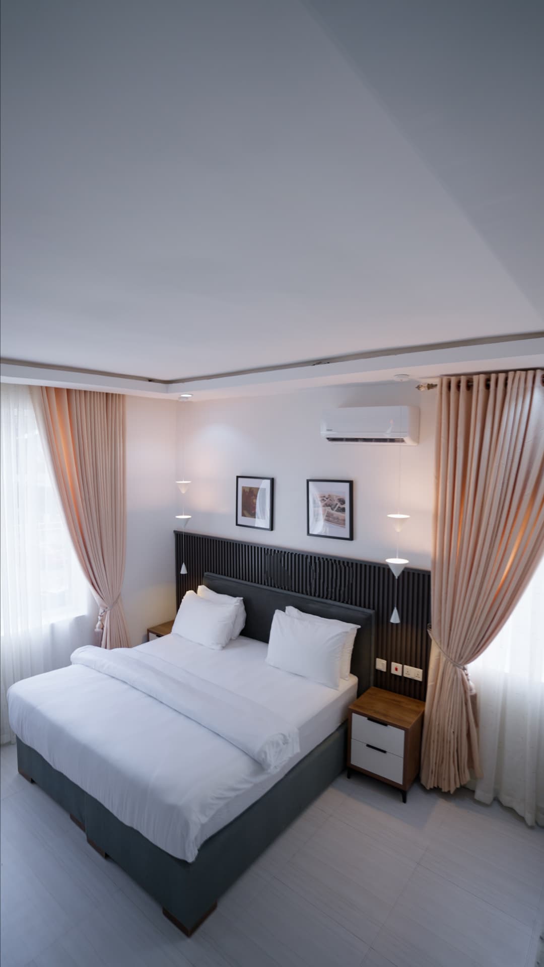
The CharlesGate is a luxury short-let in Port Harcourt serving business travellers and extended-stay guests. The rooms are genuinely well finished. None of that reached anyone deciding whether to book. Guests were choosing between listings with almost no sense of what they'd actually be walking into, and the gap between the real quality of the place and its online presence was costing bookings. This one is here because it's the clearest evidence of visual craft on something I both designed and shipped.
What made it hard
- Communicate luxury without the usual signals for it. No gold, no heavy serif slabs, no opulence as decoration.
- It had to function as a booking channel rather than a brochure, so every page needed a live conversion action.
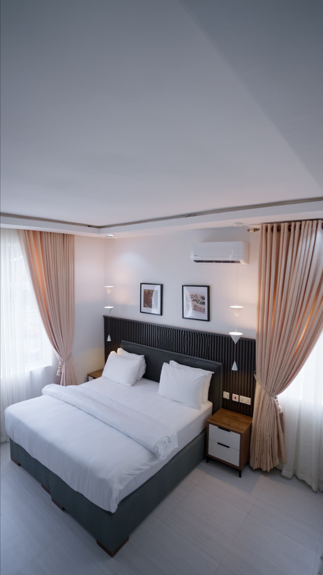
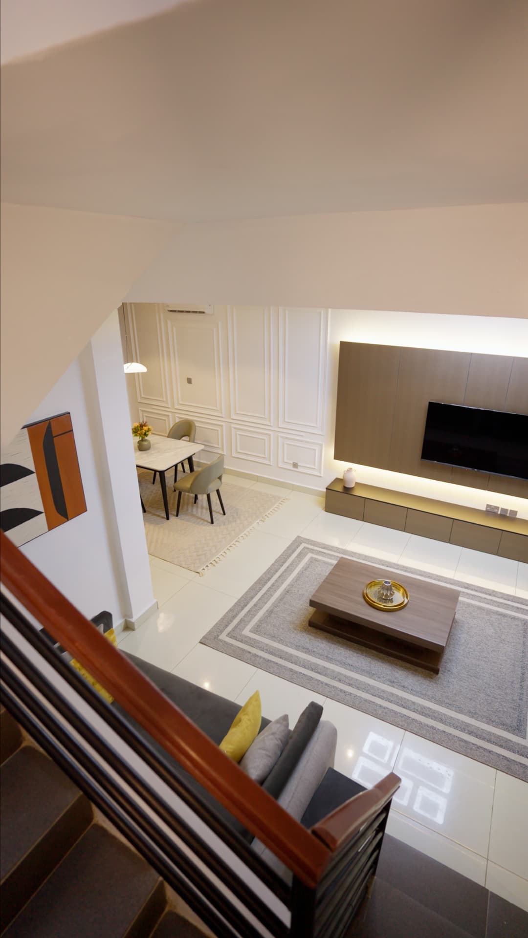
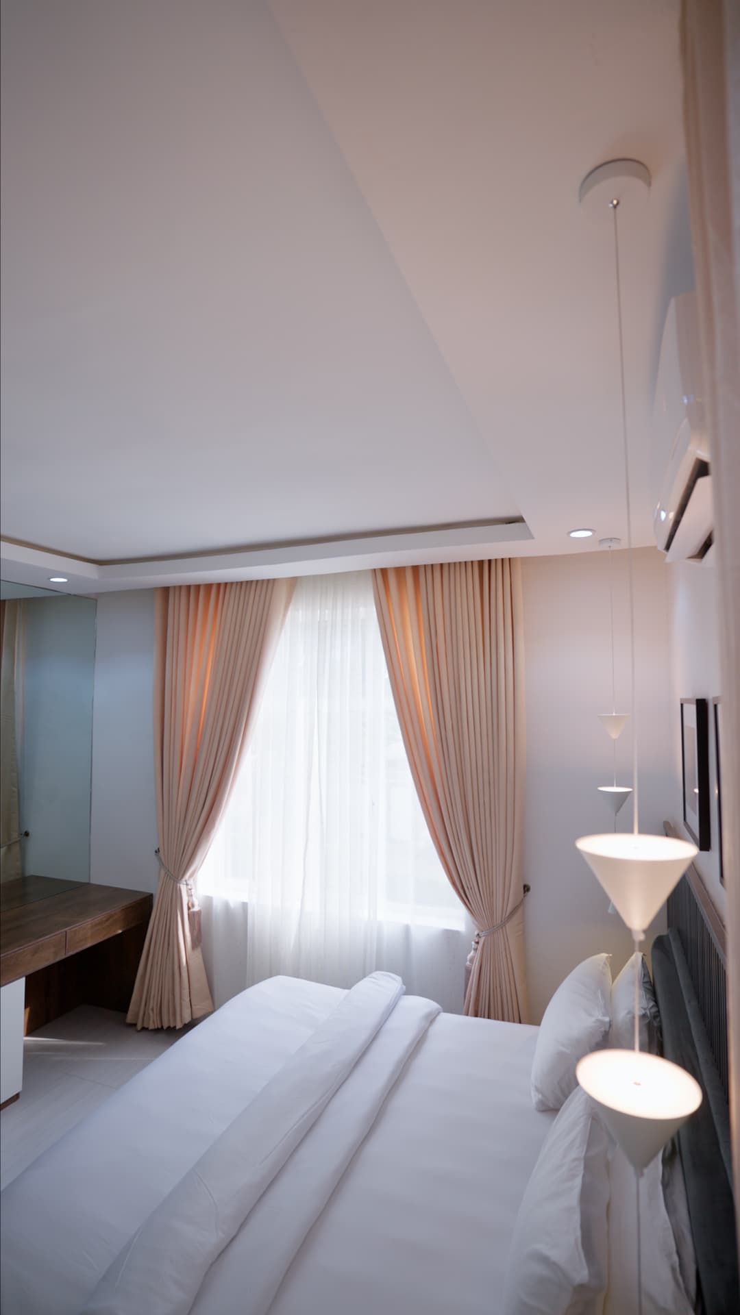
- Photography was the product. The design's job was to frame it and then get out of the way.
- Most short-let bookings happen on a phone, often while the guest is already travelling on a poor connection.
Three decisions
With what I turned down, and what each one cost.
Decision 01
The layout is a frame for the photography
- Chose
- Sparse pages, wide margins, and a near-neutral palette so the interiors carry all the colour.
- Rejected
- A designed brand layer — patterns, graphic devices, an accent colour running through the pages.
- Why
- The space is what's being sold. Anything with its own visual personality competes with the photographs, and the photographs are the only thing that answers the guest's actual question, which is what will this feel like.
- What it cost
- It puts enormous weight on photo quality. Weak images have nowhere to hide, so the shoot had to be right before the build could be finished.
Decision 02
Performance treated as a design constraint
- Chose
- Aggressive image optimisation, lazy loading, and a deliberately thin WordPress setup with no decorative animation.
- Rejected
- The richer motion and gallery transitions the first design direction called for.
- Why
- Someone comparing three properties on hotel wifi will not wait. On this site a slow gallery isn't a degraded experience, it's a lost booking. Given the choice between feeling refined and loading fast, fast wins, because slow doesn't feel refined either.
- What it cost
- The site is quieter than the first direction. It reads as restraint, which suits the brand, but that was a consequence rather than the original intent.
The work
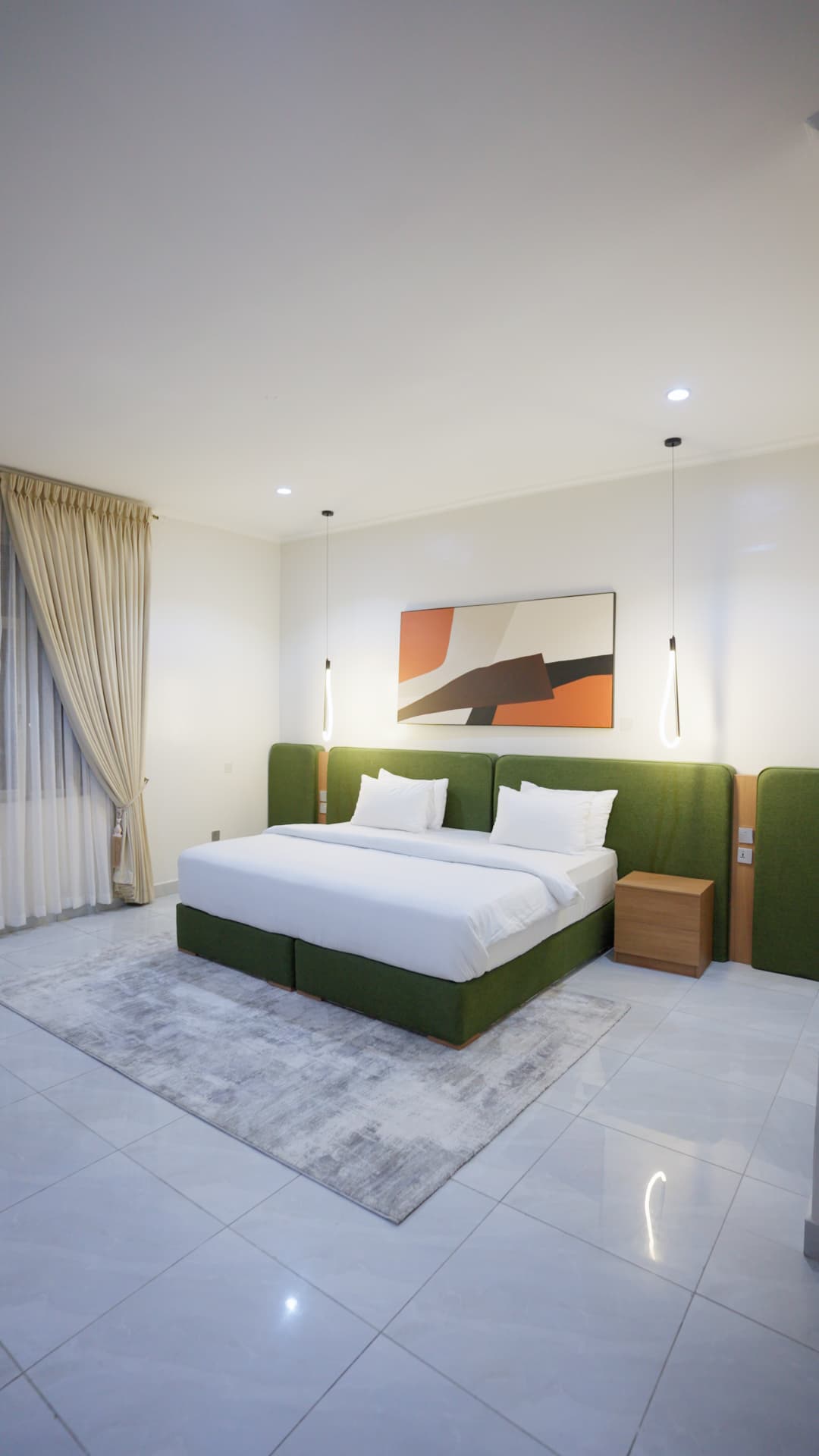
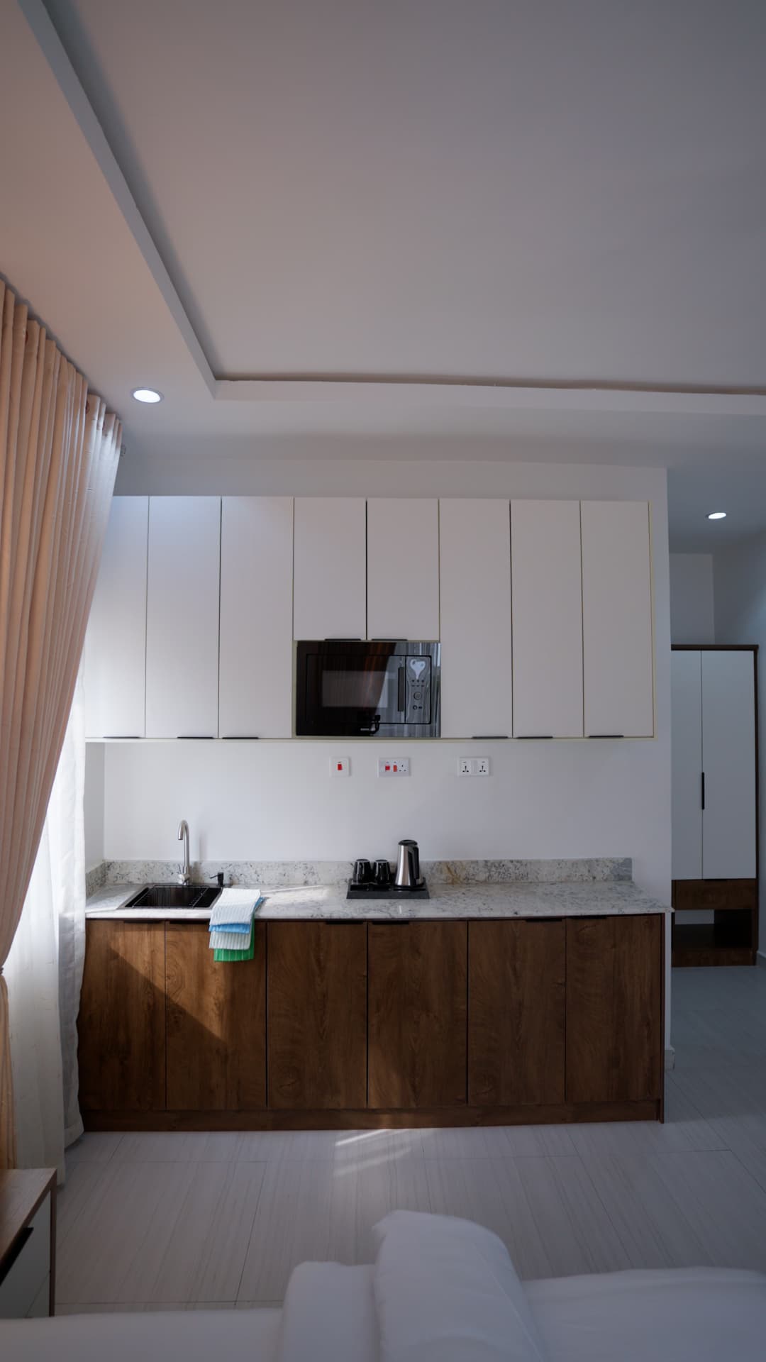
What I'd do differently
The hard part of hospitality design is restraint. Every instinct says add something. The right call was to keep removing until only the space was left. I nearly lost that argument with myself twice.