- Group brand
- Web build
- SEO
Venture Garden Group
A holding company that had to explain what it actually does
- Role
- User Experience Developer
- Team
- In-house, with marketing and the portfolio companies
- Platforms
- Web · Mobile responsive
- Status
- Shipped, in production
- Live site
- venturegardengroup.com
- Outcome
- Search visits grew roughly sixfold in the six months after the rebuild. Directional
Directional: observed in practice, not instrumented
The problem
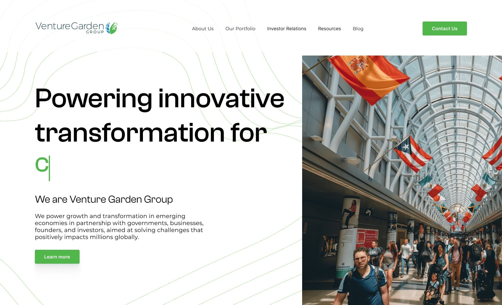
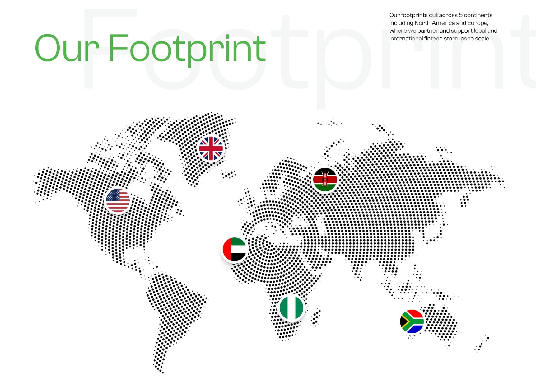
Holding companies have a structural communication problem. VGG builds, funds and staffs technology businesses across fintech, edtech, energy, aviation and agriculture, with more than twenty operating companies and investments on five continents. Every one of those audiences arrives wanting something different. A founder is looking for funding. A government partner is checking credibility. An engineer is looking for a job. An investor wants the portfolio. The old site answered all of them with an undifferentiated list of companies, which meant nobody found their own path quickly, and search engines had nothing coherent to index either. The brief was a redesign. The actual problem was that the site had no spine.
What made it hard
- The subsidiaries have their own brands, their own sites and their own opinions. The group site had to hold them together without flattening any of them.
- Four audiences with genuinely different questions, arriving on the same homepage, none of them willing to hunt.
- Credibility was the whole job. A holding company that looks small online has a harder time raising, hiring and partnering, regardless of what it actually runs.
- It had to be editable in-house by a marketing team, without an engineer in the loop for every content change.
Three decisions
With what I turned down, and what each one cost.
Decision 01
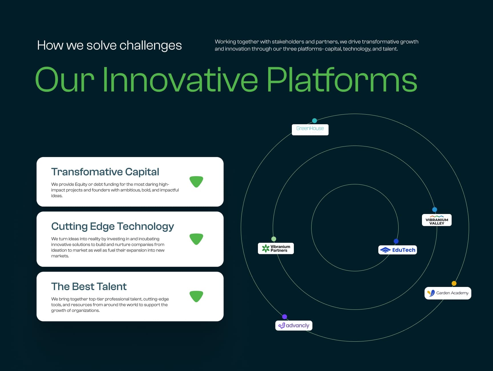
Three platforms as the spine, not a list of companies
- Chose
- Structuring the site around what the group actually does — capital, technology, talent — with the portfolio companies hanging off those three as evidence.
- Rejected
- The conventional holding-company layout, which is a logo grid of subsidiaries and a corporate About page.
- Why
- A logo grid tells you a company is big. It doesn't tell you what it does or why any of it belongs together, and it gives a visitor no route to their own question. Capital, technology and talent is a claim about the business model, and each of the four audiences maps cleanly onto one of them. It also gave the site a real hierarchy for search to index, which the flat list never had.
- What it cost
- It required agreement across the group about what the three platforms actually were, which is a positioning argument rather than a design one, and it took longer to settle than the build did.
Decision 02
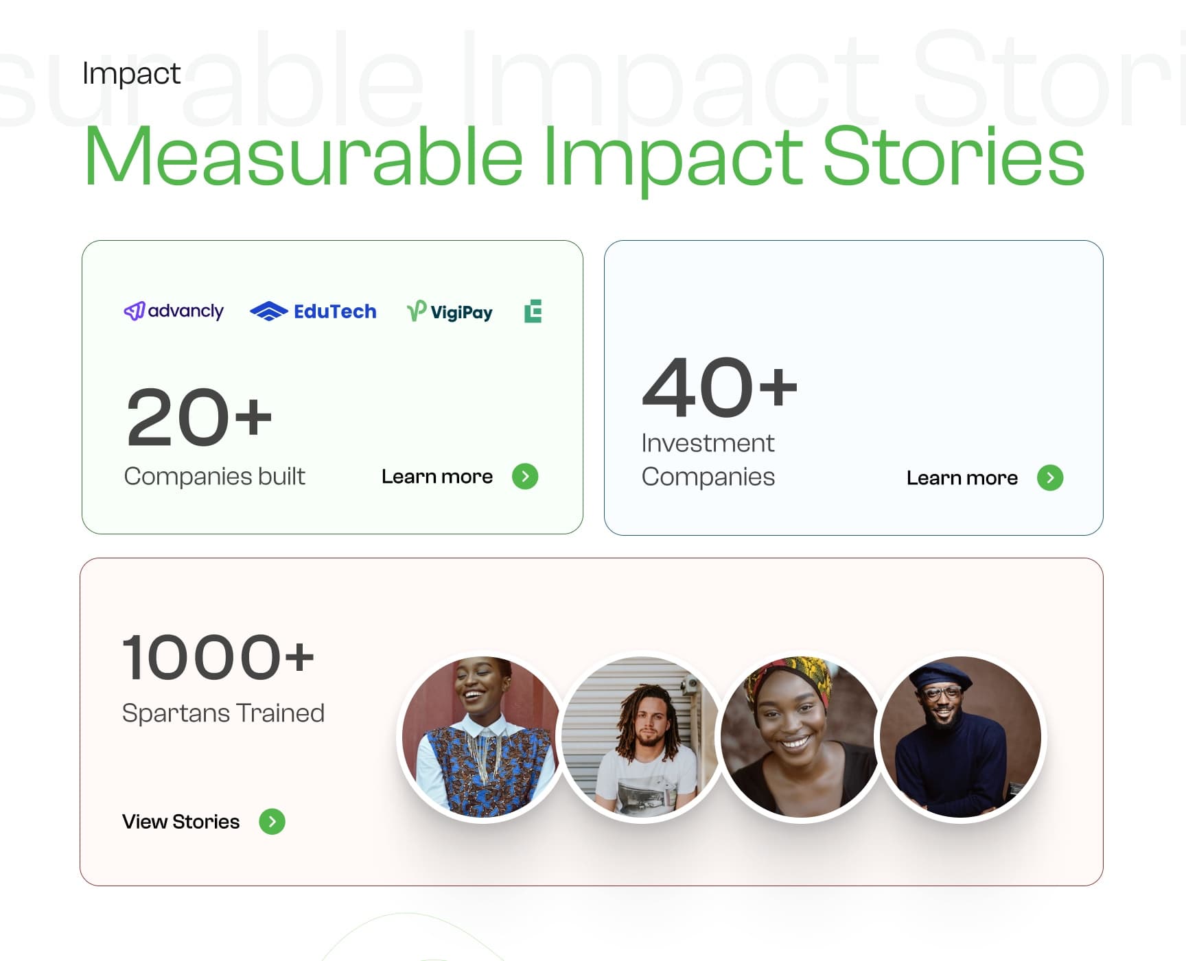
Numbers carry the credibility, not adjectives
- Chose
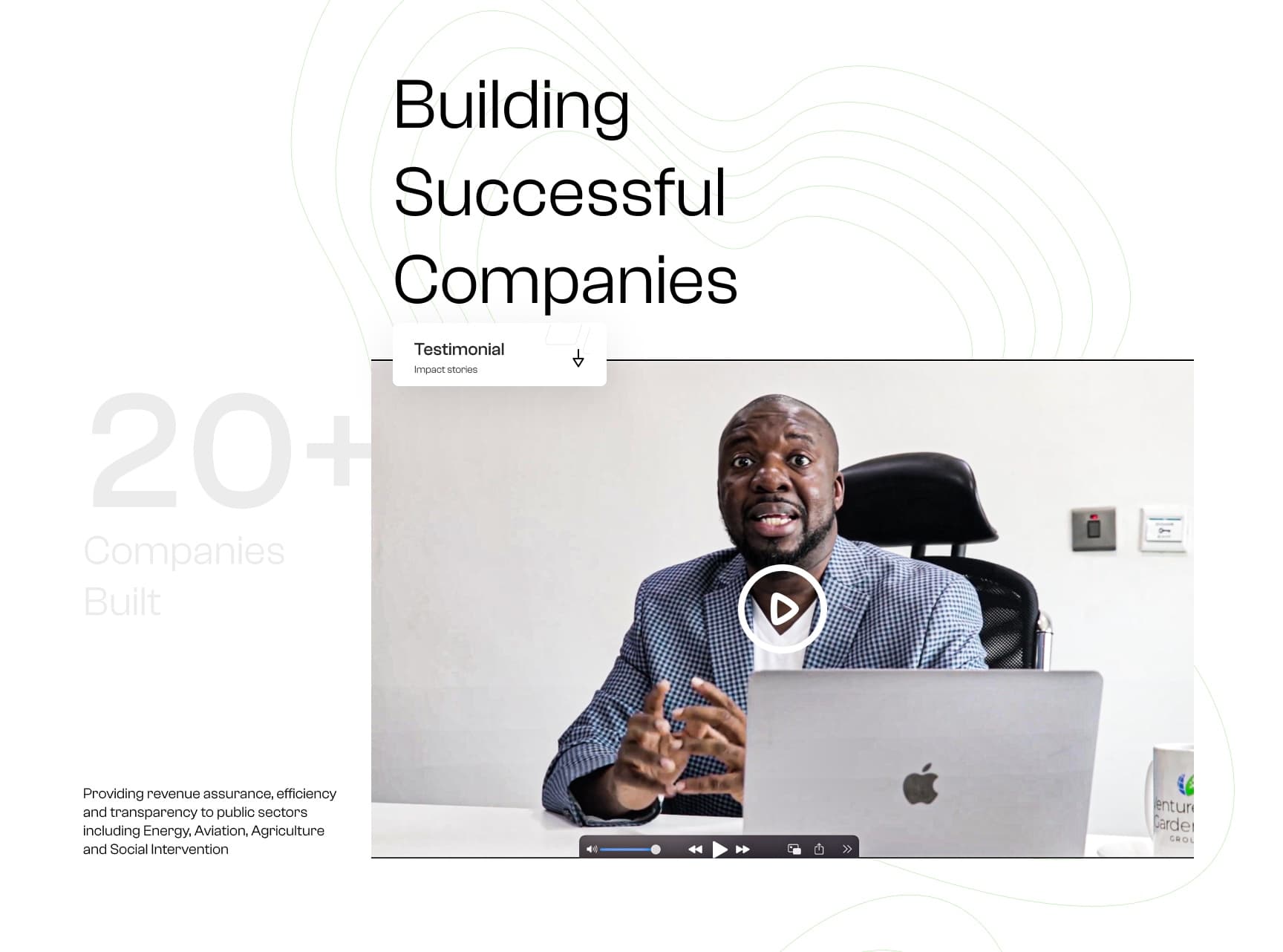
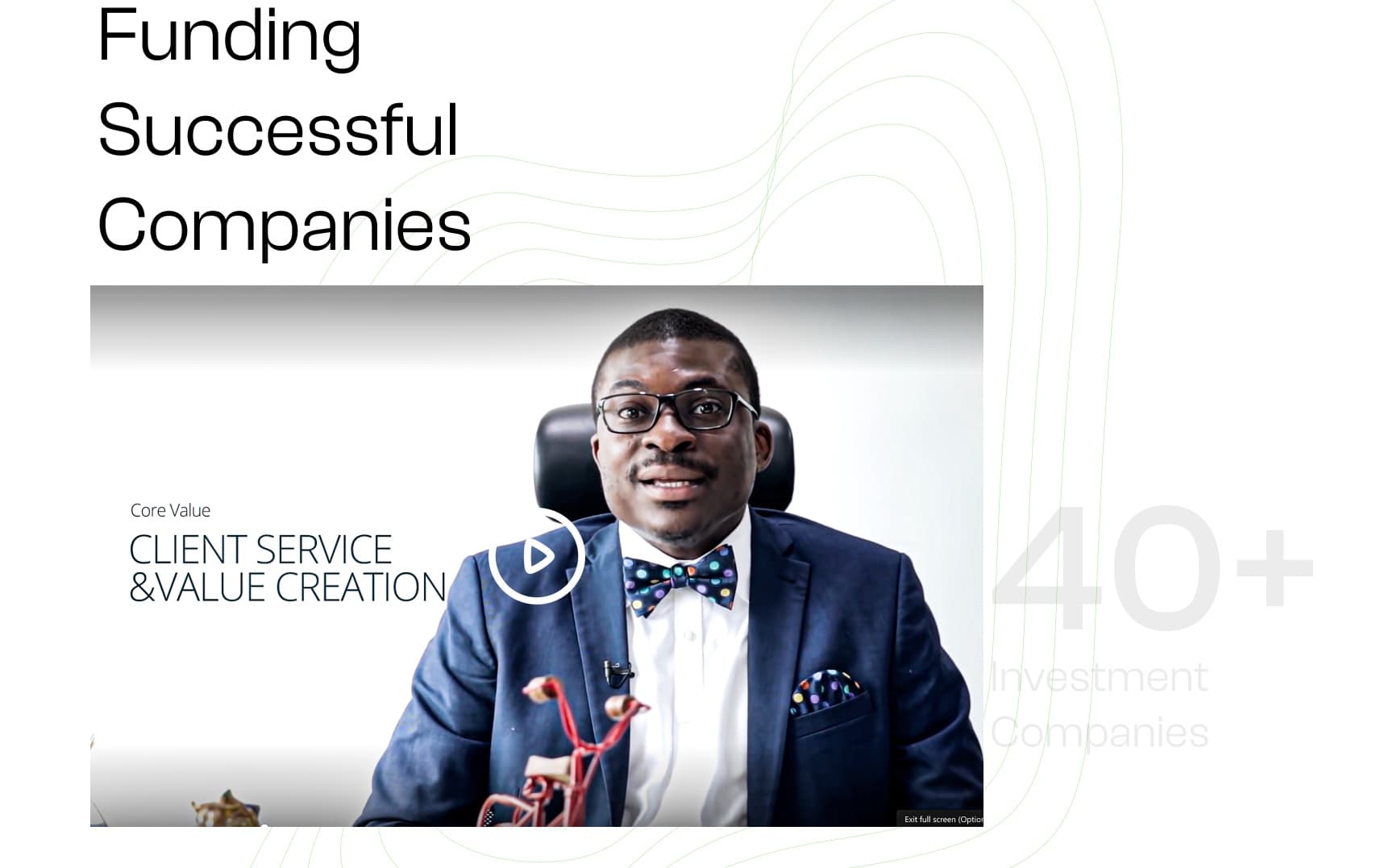
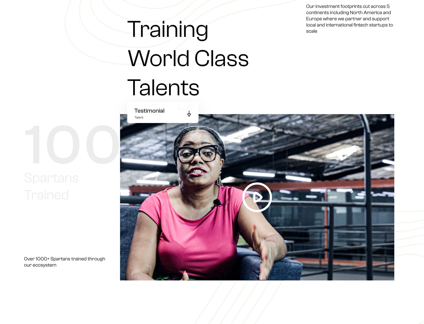
- Making the counts the visual spine of the page — 20+ companies built, 40+ investment companies, 1,000+ people trained — with each one opening into its own section.
- Rejected
- Descriptive copy about scale and ambition, which is what the previous site and most of the sector rely on.
- Why
- Every holding company describes itself as transformative. The word does no work because everyone uses it. A specific count is checkable, and a visitor deciding whether to take a meeting is doing arithmetic, not reading adjectives. Anchoring each section to a number also gave the page a memorable structure rather than a scroll of prose.
- What it cost
- It commits the organisation to keeping the numbers current. A stale count is worse than no count, so it added an ongoing maintenance obligation the marketing team had to own.
Decision 03
Information architecture rebuilt before anything was designed
- Chose
- Remapping the whole URL structure, navigation and internal linking first, then designing pages onto it.
- Rejected
- Restyling the existing pages in place, which was the faster route and what was originally asked for.
- Why
- The site's real failure was that content had accumulated without a structure, so neither people nor crawlers could tell what was important. Restyling would have made a confusing site prettier. Rebuilding the architecture is what moved search visibility, and it's the reason the traffic change was as large as it was.
- What it cost
- Every existing URL changed, which meant a full redirect map and a temporary ranking dip before the recovery. That's a real cost and it needs to be explained to stakeholders before you start, not after.
The work
What I'd do differently
I treated the redirect map as a launch task rather than a design one, and that was the wrong order. When every URL changes you get a visible dip in traffic before the recovery, and because I hadn't set that expectation up front, the first month after launch was spent defending the work instead of improving it. The rebuild was right. The way I sequenced the conversation about it wasn't. Now I put the dip in the plan on day one, with a rough shape for how long it lasts.